Author: Matyáš Levínský
How to use CSS in Obsidian
Obsidian is running in electron.js which allows us, as the End-users to treat is as a web-browser. This means tools like CSS snippets, but also what fewer people are aware of: With Ctrl+Shift+I we can open up the Inspect tool, like we would in our common browser. This allows you to make targeted changes to certain elements of your Obsidian setup.
It is generally recommended to refer to the elements without the svelte runes at the end eg.
'some-element'.svelte-m4uap8as they are auto generated, and chages by google could break your CSS snippet.\
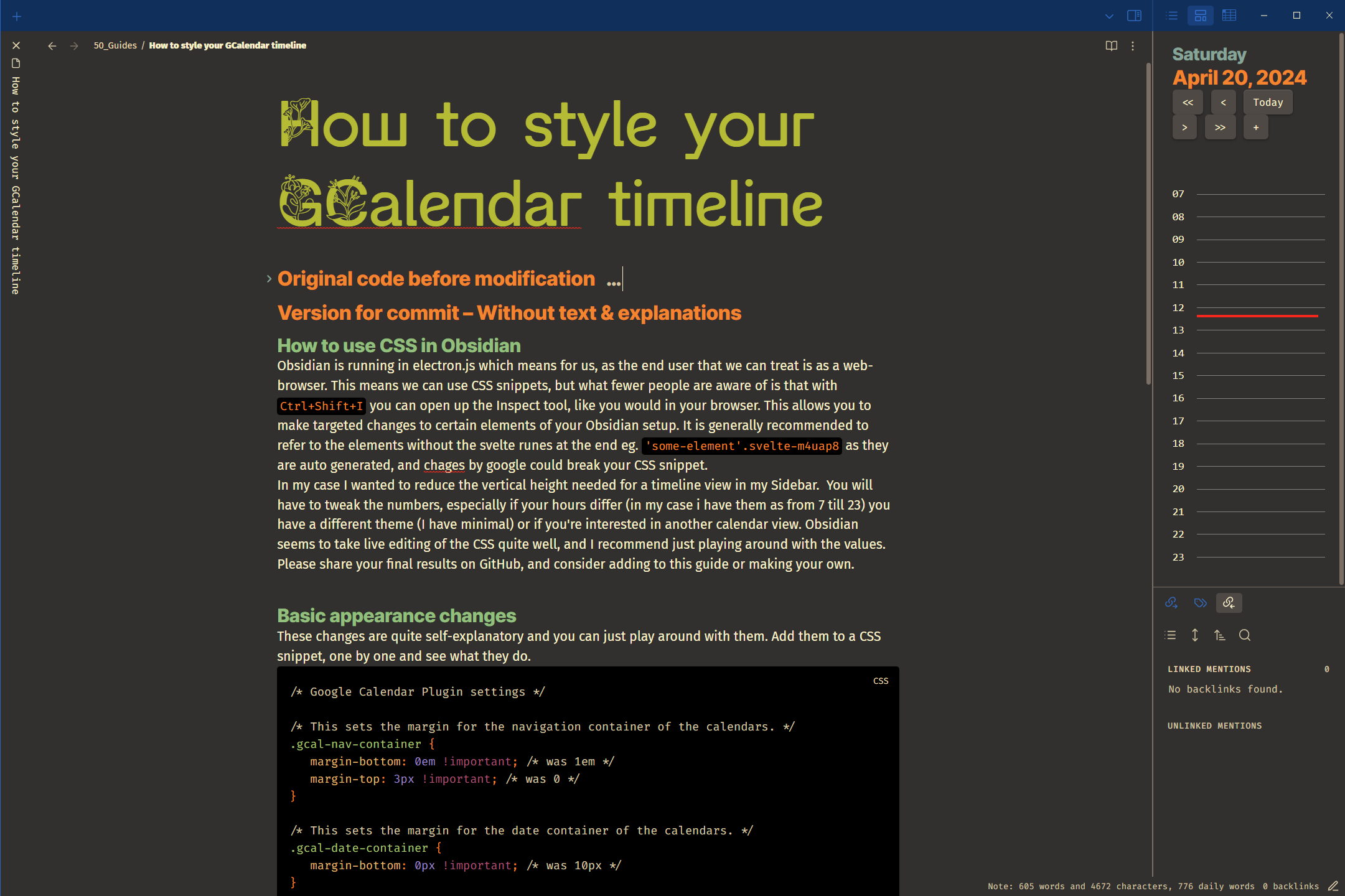
In my case I wanted to reduce the vertical height needed for a timeline view in my Sidebar. You will have to tweak the numbers, especially if your hours differ (I have them set from 7 to 23) you have a different theme (I use Minimal) or if you’re interested in another calendar view. Obsidian seems to take live editing of the CSS quite well, and I recommend just playing around with the values. Please share your final results on GitHub, and consider adding to this guide or making your own.
Basic appearance changes
These changes are quite self-explanatory and you can just play around with them. Add them to a CSS snippet, one by one and see what they do.
/* Google Calendar Plugin settings */

/* This sets the margin for the navigation container of the calendars. */
.gcal-nav-container {
   margin-bottom: 0em !important; /* was 1em */
   margin-top: 3px !important; /* was 0 */
}

/* This sets the margin for the date container of the calendars. */
.gcal-date-container {
   margin-bottom: 0px !important; /* was 10px */
}

/* Here I change the appearance of the current time indicator. */
.gcal-time-display {
    position: absolute;
    width: 100% !important; /* was 95%, determines time-line length */
    height: 3px; /* Determines time-line thickness. */
    background: #FE8019 !important; /* Determines color of time-line. */
    overflow: visible;
    z-index: 2;
}

/* This sets the margin for the timeline of the calendars. */
.gcal-timeline {
    position: relative;
    display: flex;
    flex-direction: row;
    padding-top: 0px !important;
    flex-shrink: 1000;
    min-height: 0;
    margin: -199.2px 0px 0px 0px !important; /* This together with padding-top influence the position of number and lines, make sure they allign. (This alligns if you display time from 7:00 to 23:00) */
}

/* This is further alignment of the hour numerals. */
.gcal-hour-text-container {
    display: flex;
    flex-direction: column;
    min-height: 0;
    overflow: hidden;
    margin: -208.167px 0px 0px; /* Again tweak the number as you need, it will differ for each setup. */
}
Fine tuning of Sidebar vs. codeblocks
While the I like the vertical adjustments everywhere the horizontal button slimming is only necessary for the sidebar. You can alter the look only for calendars in codeblocks - eg. in your notes, by adding .block-language-gEvent before the CSS code like this:
/* Setting the properties for all timelies, including the side-panel. */
.gcal-nav-container button {
    padding: 2px 4px;
}

/* Setting the properties of timelines in your notes, eg. withing a `codeblock`. */
.block-language-gEvent .gcal-nav-container button {
    padding: 2px 18px;
}
Before and After
Before:

After:
